Thank you for reading my blog posts, I am no longer publishing new content on this platform. You can find my latest content on either mainawycliffe.dev or All Things Typescript Newsletter (✉️)
In the last post, which you can find here, we introduced Angular Flex Layout. We looked at the APIs/Directives available to you as a developer and how you can use them. In this post, we are going to build on that foundation.
Our goal here is very simple, building a simple responsive card list, that will respond to different viewports. In this post, we are going to be using Angular 2 Material for the UI, but feel free to use a UI Library of your choice. Without further ado, let’s get started.
Getting Started
We will start by creating a new Angular Project, using Angular CLI ng new command.
$ ng new angular-flex-layout-demo
Then, we need to install Angular Flex Layout, Material and CDK (Content Development Kit) for this demo.
$ ng add @angular/material @angular/cdk
NB:
ng addwill install and setup Angular Material and CDK automatically.
$ yarn add @angular/flex-layout
After that, we are going to import FlexLayoutModule from Angular Flex Layout and MatCardModule, MatButtonModule from Angular Material inside our App Module.
// ...
import { FlexLayoutModule } from '@angular/flex-layout';
import { MatButtonModule, MatCardModule } from '@angular/material';
// ...

@NgModule({
  declarations: [
    /* ... */
  ],
  imports: [
    BrowserModule,
    FlexLayoutModule,
    MatButtonModule,
    MatCardModule // ...
  ],
  providers: [],
  bootstrap: [AppComponent]
})
export class AppModule {}
Now that we have set up our project, let’s move on to the next part, building a responsive card list UI.
Container for our Angular App
First, we are going to define the root container of our application. We are going to set the width to 100%, using fxFlex and then set the flex layout to column, using fxLayout. You can set the width to 100% by just adding fxFlex or by assigning it a value of 100% i.e. fxFlex="100%".
The column layout, set using fxLayout, forces all the children to be stacked vertically while inheriting the parent container width. We are also going to add a gap between our child elements of 10px using fxLayoutGap, so they don’t get too close to each other. Feel free to refer to the previous post here for what individual directives do.
<div fxFlex fxLayout="column" fxLayoutGap="10px" style="height:100vh">
  <!-- content here -->
</div>
Building a Responsive Card User Interface
We will start by setting up a container for our cards. This is where we will define the relationship between the cards (child elements of the container) like the flow of the card – horizontally or vertically. Here, we need our elements to flow horizontally but wrap when they get to the end. So, in this case, we will use fxLayout="row wrap" instead of just row alone.
<div fxLayout="row wrap"><!-- card list here --></div>
Please note, we did not set the width because it will automatically inherit the width from the parent container which has a flex layout of column, so by default it is 100%. Next, let’s add some responsive cards. We can add the cards directly, but since we want a uniform padding of 5px around the card, and since there is no way of doing so with material cards component, we will wrap it around a container.
The card container will carry all the responsive properties. First, we need to set the width of the card based on the browser’s viewport, we will use fxFlex directive, followed by the breakpoint of the device viewport we are targeting, separated by a dot(.). For instance, for extra small devices (xs) fxFlex.xs="100" or for medium devices(md) fxFlex="33.3". And then, we need to set the layout (fxLayout) to column, ensuring the material card will fill the width.
<div
  *ngFor="let card of cardList"
  fxFlex="25"
  fxFlex.md="33"
  fxFlex.sm="50"
  fxFlex.xs="100"
  fxLayout="column"
  style="padding: 5px;"
>
  <!-- material card here -->
</div>
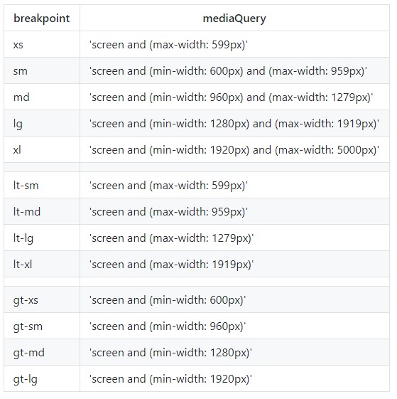
For breakpoints, you can refer to the table below:
NB:
cardListis a property of our component, will a list of 10 cards, createdngOnInitmethod.
You can view the components class here for more details. This allows us to use *ngFor to loop over it creating 10 cards, or any number we wish to. Angular Material Card Component For our card, it will be just a normal card, nothing special about it, you can easily replace it with anything:
<mat-card>
  <img mat-card-image [src]="card.imgSrc" />
  <mat-card-title> {{ card.title }} </mat-card-title>
  <mat-card-content> {{ card.description }} </mat-card-content>
  <mat-card-footer>
    <button fxFlex mat-flat-button color="primary">Do Something Button</button>
  </mat-card-footer>
</mat-card>
Final Code
You can find the code for this post here.
Final Thoughts
In this post, we saw how we can build simple responsive layout using Angular Flex Layout. Hopefully, this gave you an idea on how you can integrate angular flex layout in your projects. In a future post, we are going to cover adaptive layouts design using Angular Flex Layout. If you have any topic suggestions or questions, feel free to leave them in the comment section below.