Thank you for reading my blog posts, I am no longer publishing new content on this platform. You can find my latest content on either mainawycliffe.dev or All Things Typescript Newsletter (✉️)
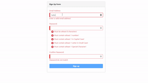
In this post, we are going to be creating a simple signup form, with email, password and confirm password controls. We will then validate the data to ensure it fulfills our requirement before a user can submit the form. We are going to enforce the following rules for the password:
- Must be at least 8 characters in length,
- Must be alphanumeric, with at least one upper and one lower case character
- And must have at least one special character.
We are going to validate each of the 5 rules individually using RegExp. And then, we will display a nice visual interface indicating to the user which rule they have not fulfilled. We will also be checking to see whether the password and the confirmation passwords are a match. Here is what the end-product will look like:
In this demo, we are going to use bootstrap for the user interface and Material Icons set for icons. Feel free to use the UI Library and Icon set of your choice. So, without further ado.
Getting Started
First, we are going to create a new project using Angular CLI.
$ ng new ng-bootstrap-password-validation-example
Then, we need to install and setup bootstrap for our angular project. First, install bootstrap using your favorite package manager:
$ npm install -s bootstrap

// or

$ yarn add bootstrap
Then, add bootstrap SCSS Styles to the list of styles for your project inside your angular.json file. There are three of them, but only one is necessary - node_modules/bootstrap/scss/bootstrap.scss.
...
"styles": [
  "src/styles.css",
  "node_modules/bootstrap/scss/bootstrap-grid.scss",
  "node_modules/bootstrap/scss/bootstrap-reboot.scss",
  "node_modules/bootstrap/scss/bootstrap.scss"
],
...
Next, we need to add material icons to our angular project. Open your index.html (Located inside the src directory at the root of your angular workspace) and add the following link:
<link
  href="https://fonts.googleapis.com/icon?family=Material+Icons"
  rel="stylesheet"
/>
This is the easiest way to add material icons to your project. If you are interested in learning of the other ways of adding material icons to any project, you can visit the official guide here. And finally, we need to vertically re-align material icons, so they appear more centralized. We will use the following CSS code:
.material-icons {
   display: inline-flex;
   vertical-align: middle;
}
Add the above code in your app styles, by default its styles.css located under the src directory at the root of your angular workspace. The last thing we need to do is import the modules we need in our app module. In this project, we are going to require ReactiveFormsModule only, since we are building a reactive form. So, let’s add that module to our imports in the app module (By default app.module.ts).
@NgModule({
  ...
  imports: [
   BrowserModule,
   ReactiveFormsModule
  ],
  ...
})
export class AppModule {}
Building a Custom Validator
Angular provides built in validators, but in our case they won’t help us achieve what we want. We need a custom validator that uses regex to check whether a password contains a special character or a number and report the error to back to us.
NB: If you want to learn more about creating a custom validator, please visit the following link where I cover it in greater details.
So, our custom validator will accept the validation RegExp expression, and validation error object to return if it encounters an error. For instance, if we want to check whether it has a number, we will pass the following:
patternValidator(/\d/, { hasNumber: true }),
Where /\d/ is the RegExp expression for checking if it has a number and { hasNumber: true } is our error to return. The error part of our parameters will allow us to use the control.hasError("hasNumber") within our template, when checking whether to show the error. Now, let’s build our validator. First, we are going to create a CustomValidators class, where we can place multiple custom validator methods for our project.
$ ng g class custom-validators
Then, we are going to add a static pattern validator (patternValidator) method.
NB: Follow the comments to see what individual lines of code do.
static patternValidator(regex: RegExp, error: ValidationErrors): ValidatorFn {
  return (control: AbstractControl): { [key: string]: any } => {
    if (!control.value) {
      // if control is empty return no error
      return null;
    }

    // test the value of the control against the regexp supplied
    const valid = regex.test(control.value);

    // if true, return no error (no error), else return error passed in the second parameter
    return valid ? null : error;
  };
}
And we also need a second CustomValidator to check whether our password and confirm password are a match. Add a second customValidator, called passwordMatchValidator and add the following code.
NB: You can follow the comments on the code for what individual lines do.
static passwordMatchValidator(control: AbstractControl) {
  const password: string = control.get('password').value; // get password from our password form control
  const confirmPassword: string = control.get('confirmPassword').value; // get password from our confirmPassword form control
  // compare is the password math
  if (password !== confirmPassword) {
    // if they don't match, set an error in our confirmPassword form control
    control.get('confirmPassword').setErrors({ NoPassswordMatch: true });
  }
}
Building Our Signup Form
For this project, we are going to use the default component – AppComponent.
Component Class
First, we need to inject the FormBuilder in to our component.
constructor(private fb: FormBuilder) {}
Next, we need to add a new property in our component class – frmSignup, that will hold information about our form:
public frmSignup: FormGroup;
Next, we need to create a method for adding form controls to the frmSignup property we just created above: We call the method createSignupForm, and it will return a FormGroup class.
createSignupForm(): FormGroup {}
Then inside the createSignupForm() method above, we need to add the controls for our form and the validation rules required.
NB: Follow the comments below for more information about individual lines of code.
createSignupForm(): FormGroup {
  return this.fb.group(
    {
      // email is required and must be a valid email email
      email: [null, Validators.compose([
         Validators.email,
         Validators.required])
      ],
      password: [ null, Validators.compose([
         // 1. Password Field is Required
         Validators.required,
         // 2. check whether the entered password has a number
         CustomValidators.patternValidator(/\d/, { hasNumber: true }),
         // 3. check whether the entered password has upper case letter
         CustomValidators.patternValidator(/[A-Z]/, { hasCapitalCase: true }),
         // 4. check whether the entered password has a lower-case letter
         CustomValidators.patternValidator(/[a-z]/, { hasSmallCase: true }),
         // 5. check whether the entered password has a special character
         CustomValidators.patternValidator(/[ [!@#$%^&*()_+-=[]{};':"|,.<>/?]/](<mailto:!@#$%^&*()_+-=[]{};':"|,.<>/?]/>), { hasSpecialCharacters: true }),
         // 6. Has a minimum length of 8 characters
         Validators.minLength(8)])
      ],
      confirmPassword: [null, Validators.compose([Validators.required])]
   },
   {
      // check whether our password and confirm password match
      validator: CustomValidators.passwordMatchValidator
   });
}
Are you still with me? Now let’s move to our component template.
Component Template:
We will create a normal reactive form as you normally would:
<form [formGroup]="frmSignup" (submit)="submit()"></form>
Then, we add our individual form controls:
<input id="email" formControlName="email" type="email" class="form-control" />
Then, we need to show validation errors to users. For instance, to check whether the email provided is valid, we use the following expression:
frmSignup.controls['email'].hasError('email')
And the same for a required form field:
frmSignup.controls['email'].hasError('required')
And to display a message, we can simply use *ngIf:
<label
  class="text-danger"
  *ngIf="frmSignup.controls['email'].hasError('email')"
>
  Enter a valid email address!
</label>
NB: This will display the
Enter a valid Email Address!error only when there is such an error. You can do the same for required, and custom validation errors.
The same goes for confirming whether confirm password and password are a match:
<label
  class="text-danger"
  *ngIf="frmSignup.controls['confirmPassword'].hasError('NoPassswordMatch')"
>
  Password do not match
</label>
We can also add a red border around our form field to give the error some prominence. We are going to add is-invalid bootstrap class using ngClass, adding the class when the form control has an error and remove it when there is no error:
[ngClass]="frmSignup.controls['email'].invalid ? 'is-invalid' : ''"
So, now our form field looks like this:
<input
  id="email"
  formControlName="email"
  type="email"
  class="form-control"
  [ngClass]="frmSignup.controls['email'].invalid ? 'is-invalid' : ''"
/>
Password Rules Validation
There is not much difference from the above code when it customs to custom validation rules.
<label
  class="text-danger"
  *ngIf="frmSignup.controls['password'].hasError('hasNumber')"
>
  Must have at least 1 number!
</label>
But, since we don’t want to just hide and show the errors as with other form fields, we want to show text with green font for rules the password has fulfilled, and a red font color for rules not fulfilled. So, instead of *ngIf, we will use a ngClass, to switch between bootstrap classes text-success and text-danger.
[ngClass]="frmSignup.controls['password'].hasError('required') ||
frmSignup.controls['password'].hasError('hasNumber')  ? 'text-danger' :
'text-success'"
We also need to do the same for icons, showing a check icon when a rule has been fulfilled and cancel icon otherwise.
<i class="material-icons">
  {{ frmSignup.controls['password'].hasError('required') ||
  frmSignup.controls['password'].hasError('hasNumber') ? 'cancel' :
  'check_circle' }}
</i>
So, our complete code will look like this for checking whether password has a number:
<label
  class="col"
  [ngClass]="frmSignup.controls['password'].hasError('required') || frmSignup.controls['password'].hasError('hasNumber')  ? 'text-danger' :'text-success'"
>
  <i class="material-icons">
    {{
    frmSignup.controls['password'].hasError('frmSignup.controls['password'].hasError('hasNumber')
    ? 'cancel' : 'check_circle' }}
  </i>
  Must contain atleast 1 number!
</label>
And the same goes for our other password rules:
<label
  [ngClass]="frmSignup.controls['password'].hasError('required') || frmSignup.controls['password'].hasError('minlength')  ? 'text-danger' : 'text-success'"
>
  <i class="material-icons">
    {{ frmSignup.controls['password'].hasError('required') ||
    frmSignup.controls['password'].hasError('minlength') ? 'cancel' :
    'check_circle' }}
  </i>
  Must be at least 8 characters!
</label>

<label
  class="col"
  [ngClass]="frmSignup.controls['password'].hasError('required') || frmSignup.controls['password'].hasError('hasNumber')  ? 'text-danger' : 'text-success'"
>
  <i class="material-icons">
    {{ frmSignup.controls['password'].hasError('required') ||
    frmSignup.controls['password'].hasError('hasNumber') ? 'cancel' :
    'check_circle' }}
  </i>
  Must contain at least 1 number!
</label>

<label
  class="col"
  [ngClass]="frmSignup.controls['password'].hasError('required') || frmSignup.controls['password'].hasError('hasCapitalCase')  ? 'text-danger' : 'text-success'"
>
  <i class="material-icons">
    {{ frmSignup.controls['password'].hasError('required') ||
    frmSignup.controls['password'].hasError('hasCapitalCase') ? 'cancel' :
    'check_circle' }}
  </i>
  Must contain at least 1 in Capital Case!
</label>

<label
  class="col"
  [ngClass]="frmSignup.controls['password'].hasError('required') || frmSignup.controls['password'].hasError('hasSmallCase')  ? 'text-danger' : 'text-success'"
>
  <i class="material-icons">
    {{ frmSignup.controls['password'].hasError('required') ||
    frmSignup.controls['password'].hasError('hasSmallCase') ? 'cancel' :
    'check_circle' }}
  </i>
  Must contain at least 1 Letter in Small Case!
</label>

<label
  class="col"
  [ngClass]="frmSignup.controls['password'].hasError('required') || frmSignup.controls['password'].hasError('hasSpecialCharacters') ? 'text-danger' : 'text-success'"
>
  <i class="material-icons">
    {{ frmSignup.controls['password'].hasError('required') ||
    frmSignup.controls['password'].hasError('hasSpecialCharacters') ? 'cancel' :
    'check_circle' }}
  </i>
  Must contain at least 1 Special Character!
</label>
Demo and Source Code
You can find a demo to play with here and the complete source code for the above project here.