Thank you for reading my blog posts, I am no longer publishing new content on this platform. You can find my latest content on either mainawycliffe.dev or All Things Typescript Newsletter (✉️)
Material design has been with us for the last few years. The material guidelines spec sheet, found here, has evolved since the original design, on release. This can be seen in various Google products, as they continue updating their products according to the updated spec sheet.
Angular 2 Material may be slightly behind the latest material design specification, but it’s catching up. In this post, we are going to look at how you can change the default appearance of Angular Material Form Field Component.
But first, let’s see where we are coming from.
Some History of Material Form Field (Text Field) Appearance
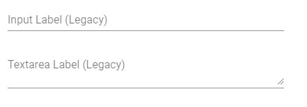
When the material design guidelines were initially released, the text field appearance looked something like this:

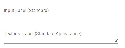
This is known as legacy appearance, then, later it was given an update (mainly under the hood) in what is called as standard appearance. And that looks like this:

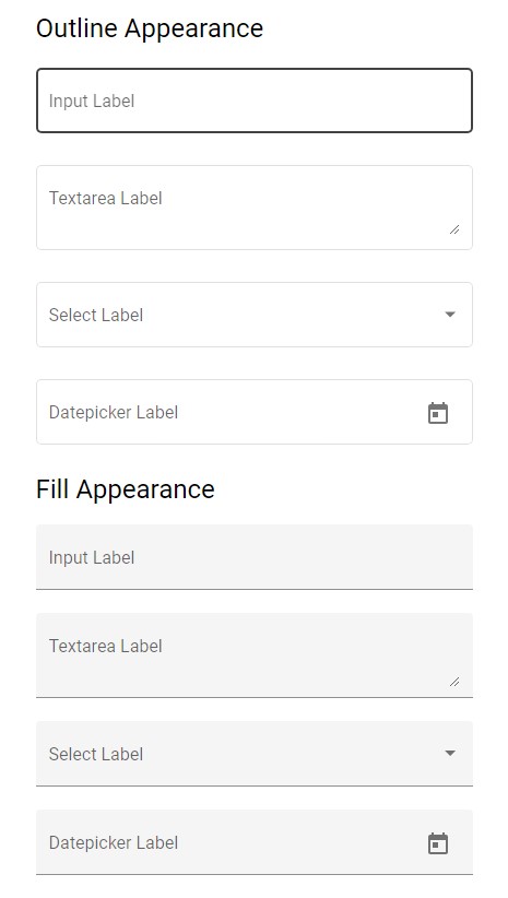
I know, the two are largely indistinguishable. Then, latter, two more appearances were introduced - the outline and fill appearance. Here are some examples on what they look like:

And then they finally did away with the first two appearances – Legacy and Standard Appearance. So, as of today, we only have two appearances – outline and fill appearance.
Enough with history, let’s go back to Angular Material. If you have updated to the latest version of Angular Material, you will note that nothing has changed in your material form field controls. Why? This is because, to use the new form field appearance, you have to specify which appearance to use.
NB: By default, everything stays as it were in older versions of Angular Material. This may change in the future though.
There are two main approaches with this. The first is to define the appearance for each individual form field component. And the second option is to set a default appearance to apply to all material form field components in your app.
Let’s look at the first method:
Individual Material Form Field Component Appearance
This is quite simple to achieve, as all you have to do is specify the appearance property/attribute of the material form field component.
<!-- setting outline form field appearance -->
<mat-form-field appearance="outline">
  <mat-label>Input Label </mat-label>
  <input matInput placeholder="Input placeholder" />
</mat-form-field>

<!-- setting fill form field appearance -->
<mat-form-field appearance="fill">
  <mat-label>Input Label </mat-label>
  <input matInput placeholder="Input placeholder" />
</mat-form-field>
NB: You must specify the label of the material form field component. This is unlike the standard and legacy appearance which used the placeholder as a label when the label is not specified.
You can also set the appearance to either legacy and standard appearance, since Angular Material has not dropped support for both.
<!-- setting standard form field appearance -->
<mat-form-field appearance="standard">
  <mat-label>Input Label </mat-label>
  <input matInput placeholder="Input placeholder" />
</mat-form-field>
Setting the Default Appearance
In the first step, we were setting form field appearance to individual form field components. This can be a lot of work, for instance, if you wanted to switch from one appearance to another for all your material form fields.
Another option is to set the default form field component appearance, then use the above method to change individual form field to your preference. This way, whenever you don’t specify appearance attribute (property), then the default is used.
To achieve this, we are going to use token injection (MAT_FORM_FIELD_DEFAULT_OPTIONS) to set the default form field appearance.
First, let’s define our appearance constant of type MatFormFieldDefaultOptions which will contain default appearance. In our case, we will be setting our form field appearance as outline.
const appearance: MatFormFieldDefaultOptions = {
  appearance: 'outline'
};
Then, inside our array of providers, we need to provide MAT_FORM_FIELD_DEFAULT_OPTIONS and set the value to appearance constant we created above:
// ... imports above
@NgModule({
  declarations: [
    //... Components, Pipes, Directives etc
  ],
  imports: [
    BrowserModule
    // ... Imports like Material Form Fiel Module
  ],
  providers: [
    {
      provide: MAT_FORM_FIELD_DEFAULT_OPTIONS,
      useValue: appearance
    }
    // ... other providers like services
  ],
  bootstrap: [AppComponent]
})
export class AppModule {}
And that’s it, all your material form field components should be switched to outline form field appearance. You can now use the first method to set form field appearance for individual form field control.

NB: You can also use this token injection token method to set the default form field appearance on an individual component too, as illustrated here.
// ... imports

@Component({
  selector: 'app-fill-appearance-default',
  templateUrl: './fill-appearance-default.component.html',
  styleUrls: ['./fill-appearance-default.component.css'],
  providers: [
    {
      provide: MAT_FORM_FIELD_DEFAULT_OPTIONS,
      useValue: appearance
    }
  ]
})
export class FillAppearanceDefaultComponent implements OnInit {
  // ... components methods and properties
}
Source Code and Demo
You can find the above source code here and a demo of all supported material form field appearance here.