Thank you for reading my blog posts, I am no longer publishing new content on this platform. You can find my latest content on either mainawycliffe.dev or All Things Typescript Newsletter (✉️)
In this post, I am going introduce and look at how you can get started with Angular Flex Layout. We will briefly introduce the APIs for Angular Flex Layout and look at how to add it to your project. Angular Flex Layout is a stand-alone library developed by the Angular Team for designing sophisticated layouts. If you have used Bootstrap before, this provides only the Layout (Grid) Component only.
This means that you can use it in combination with other UI frameworks not just Angular 2 Material. Unlike bootstrap though, it uses directives based API instead of CSS Classes. I find this to be more powerful and flexible compared to Bootstrap. Before we get started, please note that, this library is still in beta. Don’t let that stop you from using it though since it’s pretty stable and have used it in production before.
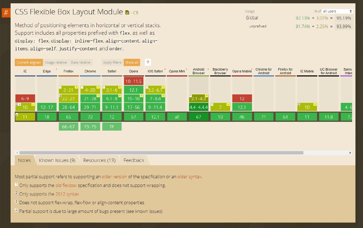
One more thing to note, browser support can be an issue, if your users are using older browsers such as IE. But, as it currently stands over 90% of users currently have browsers that supports CSS flexbox. Please note, this also affects Bootstrap 4 as both use CSS Flexbox. For older browser support, I would recommend older versions of Bootstrap.
Static Design APIs (Directives)
First, let’s walk over the essential APIs you need to be aware of to get started. This APIs are also known as static APIs. I am going to try and keep things simple and straight forward. We are going to divide this APIs into 3 groups, based on where and how they are used: The first group will cover APIs for containers – parent containers i.e. DIVs. While the second will cover APIs for container elements – html elements inside the container from the first group. And the third will cover APIs that can be applied on any element regardless of whether it’s a container or a container element.
NB: The Angular Flex Layout APIs are accessed through Angular directives.
Parent Containers
fxLayout
This directive allows you to determine how the child elements within the parent container relate to each other. There are 5 possible values: row, column, row-reverse, column-reverse and row wrap. Row dictates that all child elements are in a single row, doesn’t matter if they fit or don’t fit inside the parent container. And this is why we have row wrap, which allows elements to overwrap to the next line if they don’t fit in the current container. Column on the other hand, sets one item per row and that’s it. The default value is row.
Example:
<div fxLayout="row"></div>
<div fxLayout="row wrap"></div>
<div fxLayout="column"></div>
fxLayoutAlign
As the name suggests, this directive will define the alignment of the child elements within the container. It accepts one or two values, with the first value defining the main-axis alignment and second value cross-axis alignment. Possible values for main-axis alignment are: start, center, end, space-around, space-between. While possible values for cross-axis alignment are: start, center, end and stretch. Example:
fxLayoutAlign="center center"
<!--align center bother horizontally and
vertically. -->
fxLayoutAlign="center end"
<!-- align center horizontally and bottom
vertically. -->
NB: Main-axis and cross-axis vary based on the layout used. For instance, when using row for the layout, cross-axis is the vertical alignment and when using column for the layout, it becomes the horizontal alignment. You can learn more about cross-axis alignment here and main-axis alignment here.
fxLayoutGap
This directive defines the space between child elements within the container. The value can be given in px, % , vh or vw. There isn’t a lot to say about this specific directive.
Containers Elements/Children
fxFlex
This directive allows you to set the width of an element. You can use percentage, pixel or any other acceptable measurement unit. If you add it without any value (just fxFlex), it will fill the remaining width of the parent html element. This means that, if you had two elements within the same container, with the first having a fixed width of 100px, then the second element will occupy the remaining width. This means that, the width of the second container will always be 100% - 100px. The order of the elements doesn’t matter at all. And if you had multiple elements, with fxFlex only without a specific value, then the width is divided equally between the elements. This only applies to elements inside a container with a flex layout of row (or row wrap) not column. For columns, the default width of the elements within is 100% unless otherwise provided using this directive.
NB: if you don’t specify the unit of measure (i.e. px, vh, vw or %) it defaults to percentage point, so leaving it as 70, it will be translated as 70%.
fxFlexOffset
This sets the margin between the current html element and the last element within a fxLayout container. If it’s the first element, then it sets the distance between the border of the parent container and the start of the element. It accepts %, px, vh or vh for its values.
fxFill or fxFlexFill
This directive instructs a child html element to fill the height and the width of the parent contains.
fxFlexOrder
Defines the position of the current elements within a fxLayout container. It accepts only integers indicating the position of the current element among the other elements.
fxFlexAlign
This overrides the parents cross-axis alignment, set using fxLayoutAlign above, for an element within an fxLayout container. Something to note here, it doesn’t affect the main-axis alignment, it only affects the cross-axis alignment.
General usage APIs (Directives)
The following directives (APIs) can be use on any html element regardless of whether its container, container element or none.
fxHideandfxShow– These two directives basically allow you to hide or show the current html elements and all its children.ngClassandngStyles– These two directives allows you to set classes and styles to a html element. They are an extension of angular directives with the same names.imgSrc– This directive is an extension of the native htmlsrcattribute for setting the source of the image html element.
What about Responsive Design?
In summary, the above directives (APIs) help you to define how elements behave and look like. In this section we are going to look at how you can use the above statics APIs together with Angular Flex Layout responsive APIs. Angular Flex Layout has a set of breakpoints predefined for responsive design, each of this breakpoint has name, known as alias and defines the minimum and maximum width of the breakpoint alias. It uses media Query to determine the width of the current viewport.
Here is a list of available breakpoints for Angular Flex Layout. Layout
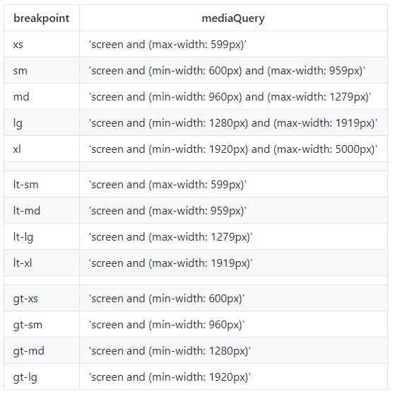
To use the above breakpoints, you combine a static API with an alias, separated by a . (dot) as shown below:
fxLayout.md="row"
fxFlex.lt-lg="100%"
ngClass.xs="some-css-class"
imgSrc.gt-md="url-to-large-image" imgSrc="url-to-normal-size-image"
imgSrc.xs="url-to-very-small-img"
NB: That last example allows you to set the appropriate image based on the screen size. It uses
gt-mdalias to set a large image src for devices larger than medium,xsto set a small image src for extra small devices. For other devices that don’t fall in to the two categories, it uses the image source that is set without an alias. In this case, the image being used by the img element will vary based on the device viewport. This approach can be applied with any angular flex layout static API directive, not just the examples given above.
As shown above, this approach provides a very flexible and powerful to responsive design, allowing you to change flexbox layout, classes, styles, image src depending on the size of the viewport. This also has the advantage of being close to your component logic, you can use properties for some of these values instead of just static values. Or this is without touching any CSS at all. On top of that, it provides an opportunity for Adaptive Design, an improvement to responsive design, that I have discussed previously here.
Adding Angular Flex Layout to your Project
First, install Angular Flex Layout using your favorite package manager:
$ yarn add @angular/flex-layout

$ npm install @angular/flex-layout
And then import it to your app module:
// ...
import { FlexLayoutModule } from '@angular/flex-layout';
//...

@NgModule({
  declarations: [AppComponent],
  imports: [
    // ...
    FlexLayoutModule // ...
  ],
  providers: [],
  bootstrap: [AppComponent]
})
export class AppModule {}
Then, you can go ahead and start using the angular flex layout APIs inside your templates.
Final Thoughts
This post was just an introduction to Angular Flex Layout. In a follow up post in the future, we will cover comprehensive examples on using Angular Flex Layout for building a responsive web app. For the time being, you can go over the official documentation here for more material and examples on Angular Flex Layout.