Thank you for reading my blog posts, I am no longer publishing new content on this platform. You can find my latest content on either mainawycliffe.dev or All Things Typescript Newsletter (✉️)
Introduction
You probably have heard about Responsive Layout design but let me remind you anyway. Responsive layout is where components and elements of a web page change size and position based on different breaking points – Web apps that adapt to any screen size.
Unlike responsive layout, in Adaptive Layouts different components and elements are displayed or hidden on different screen sizes. While responsive design is amazing at what it does, it also has it limits especially trying to fit the same components in a large screen size and an extra small screen size. Sometimes you just want to have different components and elements for different screen sizes.
How it works
Angular Flex Layout provides you with the tools for Adaptive Layout design – fxHide, fxShow and ngIf. As you may have already guessed both fxHide and fsShow directives are used for hiding elements while ngIf adds or removes components by using DOM (Direct Object Manipulation).
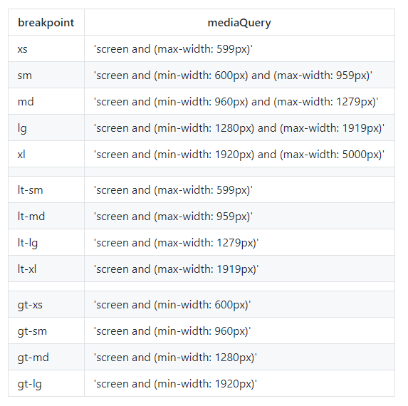
DOM manipulation may be useful at some instance by reducing the footprint of your Angular application on the browser thus reducing the resources used by your app. You can use a combination of the directives with the different breakpoint to hide and show elements on your angular application. Angular Flex Layout has four breakpoint aliases – xs, sm, md and lg. To show a component only on XS devices, you do the following:
<app-component-name fxShow="false" fxShow.xs="true"></app-component-name>
Note the fxShow Directive with the dot notation followed by the preferred breakpoint alias. The first fxShow="hide" is used to hide the component on all screen sizes so that you can show it on a specific screen using the second fxShow.xs="true". To show a component on all screens sizes above small, you can use the gt-sm (greater than small) alias as shown below:
<app-component-name fxShow="false" fxShow.gt-sm="true"></app-component-name>
This will show the components on all screen sizes starting md (medium screen size) and above. You can get a list of all breakpoints below.
Unfortunately, you can not do that with *ngIf, am not sure whether support will be coming – it’s not clear on their site. it would be amazing if you could use it as follows:
<app-component-name *ngIf.gt-sm="true"></app-component-name>
Fortunately, there’s a workaround for this, while not as nice as the one above, it requires you to add some code to your typescript file of your component. As shown below:
Component
//import obersavable media
import { ObservableMedia } from '@angular/flex-layout';

@Component({
  selector: 'app-component',
  template: 'app-component.html'
})
export class AppComponent {
  //declare a public variable of observable media
  constructor(public media: ObservableMedia) {}
}
Now you can use *ngIf in your component template as shown below
Template
<div *ngIf="media.isActive('xs')">
  This content is only shown on extra small devices
</div>
<div *ngIf="media.isActive('sm')">
  This content is only shown on small devices
</div>
<div *ngIf="media.isActive('md') || media.isActive('lg')">
  This content is only shown on medium devices and large devices
</div>
Conclusion
Adaptive Layout design is a very important tool in a developer’s arsenal. If used wisely in combination with responsive layout design, it can produce some magical results. If used poorly, it can lead to a bloated Angular app with poor performance. This is due to increased number of component that do essentially the same thing. If you have any question regarding this topic or any other feel free to drop a comment below.